Monday 31 October 2016

Contents page flat plans and rationale


On my contents page my masthead will be at the top of the page in the corner but quite small and next to that I will have contents quite big to made it stand out and I will have the cover date and the issue number quite smaller and  underneath them their will be social media icons to show that we are on social media as it is very popular in alternative music. A lot of the page will be taken over by my dominate image of my model underneath them their will be a guest editors note from the same person in the dominate image. Next to my guest editors note their will be a sub image of a different model which will help bring in more fans, above them will be lists of what is in the magazine in separate sections.


The first font I will use for the 'contents' and the second font I will use for the numbers and the titles but in red and white.


The background of the top of my contents page of this will be dark blue, as again this is a popular colour with alternative fans, with a yellow zig zag going through it as the bright colour will help the top stand out. Also the background of my contents page will be white so help the colours on the page stand out. In my dominate image my model will be wearing a alternative artist t-shirt so show that they are a alternative artist that supports their fellow artists also the shirt will be black as black and dark colours are very popular with fans and artists in the alternative music genre also their facial expression will be quite sad as the article they are showing is somewhat sad so I want to show it. This photograph will be taken as a medium shot as you get to see more of them in the photograph to represent that their is more to them than what the article is about. In my sub image my model will be wearing a checked shirt  as from my research I have found that they are also popular with people who like alternative music and the artists this will be shot from behind to fit with the story line. For my numbers they will be dark red, the boxes with the titles will be blue as they will stand out from the white but also dark colours are popular with alternate music fans and artists but the writing in the boxes will be white as it will stand out from the blue so people will find it easier. The background of my dominate image will be different shades of blue with a white line around my image to help it stand out from the background. The background to my sub images will be sea as it will be a shoot at the beach as this is very popular place to listen to alternative music.
Image result for halsey shirt

DPS flat plan and rationale


In my DPS half of my page will be taken over by my dominate image to show that the artist is important.The background of my DPS is going to be black as this makes it easier for the colour from the rainbows stand out and the article and pull quotes will be white so the black background will hep that stand out too also dark colours are a big part of the alternative music genre as the fans and artists like the colours and wear a lot of them as this shows that they are alternative.
At  the side of my dominate image their will be my title also in the corner of the page their will be a running head with my magazine name, the magazine name will also be at the bottom of the page,so people remember what they are reading, with the date and the page number so people know when this was created and what page it is so it is easy to locate from the contents page.
Next to my dominate image their will be image caption which will give a small piece of information about the artist. At the side the page I will include a by line for the article and photography as it shows people who did this. Beside my dominate image I will add a subtitle which will be a quote from the artist about themselves. On the other side of my DPS is where my article will be which will include two pull quotes to capture the readers attention easier also my subtitle will be a quote from the artist about their life. 


The first font will be used for my title and the second font will be used for the pull quotes on the page.
My title will be 'Sydney shows their true colours' which is sort of a pun as they are coming out which is associated with rainbows and the DPS will have rainbows on it.
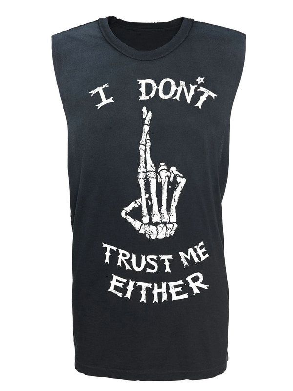
Also I will include a sub image underneath my article where my two models are together and they look happy to show that life gets better. I will be using a prop of a rainbow flag in my photograph as it brings colour to the page and it again helps re enforce that they are gay as a rainbow flag is a symbol of the LGBT+ community.My main model will be wearing a tank top,with rips and holes in as I found out from my research this is popular with fans and artists, that is popular in the alternative music community as a few alternative artists have worn it this shows that this artist is alternative too they will also be wearing a dark coloured plaid shirt as dark colours are important to fans and artists and from my research I found that they are very popular in this genre of music. with rips and holes in as I found out from my research this is popular with fans and artists.
Image result for i don't trust me either tank
Image result for burgundy plaid shirt
Image result for rainbow flag png

Front page flat plans and rationale.


On my front cover I will have my main sell line across my dominate image to help it stand out and grabs peoples attention and so that people know who the main article is about, I will also have a pull quote from the artist on top of my main sell line so that people know what the article is about and I will include a subhead which will be underneath my sell line so that it has a little more detail for my article.
At the bottom of my front cover I will include a plus bar so the people know what else is in the magazine and it will help attract the attention of fans of other artists. On one side of my dominate image their will be a sub image, with just the sell line. I will have another sub image above my dominate image with a sell line and a small subhead to make the front cover interesting, give more detail to my article and to attract more fans. On the other side of my dominate image their will be a puff to win something so that it attracts more people as they could get something for free.
On the second image the sell line and subhead will be overlapping the image to show that the story line is important for the person. In the corner of my magazine their will be a barcode with a little bit of information about the magazine and it will be small so that it doesn't look important but is still easy to find. I will have my masthead at the top of the page in the corner to make it stand out from the competition as most alternative magazine have the masthead across the top of the page with my tag line over lapping it to make sure people notice the tag line as it stands out.


The first font will be the one I use for my sell line and the second font will be the one I use for my masthead.

My dominate image will be taken at eye level with a medium close up to make it stand out on a shelf as their is someone looking at you. The costume that my model will be wearing is a burgundy jumper with a beanie as this helps represent the alternative colour also the colour will stand out from the background which will be graffiti on a wall as this makes the page look full and interesting with all of the colour. The facial expression that my model will have will be a super smiler as it shows that the topic they are talking about is nothing to be ashamed of and that even through struggles you can be happy again.
Their will be a lot of colour in my magazine as the background will be colourful, their will be small uses of bright colours such as yellow and red to help things stand out more and make it more interesting, also their will be a lot of use of white as it will stand out well against my dominate image and the background, their will be some blue and other dark colours as this represents alternative genre well as most people who listen to alternative music and artists wear a lot of dark colours.


Friday 28 October 2016

Final Costume, Hair and Make up

Powered by emaze This helped me decide and understand what costume, hair and makeup I want for my model. Organizing this before helps me tell the model what I want for the photos so that they know what they are doing. This should help my photos to be more professional looking as everything is organised.

Monday 24 October 2016

Health and Safety


This Recce helped plan my photo shoot properly so that it is more professional and the photos come out looking professional so more people will want my magazine and it helped me figure out what could go wrong during the shoot and how I could prevent that and how I can over come a situation or problem if it happens to arise. 


Saturday 22 October 2016

Model organization


This is my evidence for asking my friend to be my model and asking them where to meet me and what they will need to wear and bring. Organizing my model will help them know what they are doing on the day so I will get what I want out of my photos and they will look more professional.

Friday 21 October 2016

Photoshoot Planning


This helped me understand what I will be doing in my photoshoot and it helped me decide what my photos will be and what will be happening in them. This helped me plan my photoshoot which will help it look more professional as it organized which will help people want to buy my magazine. My model and I know exactly what we will be doing which means everything should run smoothly. 

Thursday 20 October 2016

Location Scouting


This helped me understand the different locations I could shoot in and the reasons I would shoot there. This also helped me figure out where I want to shoot which is near ryhope beach as it fits with the alternative music genre better than the rest of the location.

Tuesday 18 October 2016

Photoshop Practice

This is the front cover that I created in photoshop.
I found this task very difficult as I have never really used Photoshop before so that took up a lot of my time trying to figure out what to do and how the tools work and what they do. I don't think this turned out very well as I there is only one sub image and it looks very plain and empty this isn't something I'd want to read as it looks amateur and boring. I originally wanted a dark blue background but I couldn't figure out how to do that on Photoshop.

Friday 14 October 2016

Time Mangement

14/10/16


My aim for this lesson is to Photoshop my front cover and write a short review about it and upload it to my blog.


My results of this lesson is that I finished my front cover but I haven't wrote the review for it yet and haven't uploaded it to my blog. So I will finish my review at home and upload it to my blog. 

Wednesday 12 October 2016

Time Management.

12/10/16

My aim for this lesson is to take the pictures for the magazine and finish the front cover and contents page and do my review and rationale at home.


My results of this lesson is that the front cover and the contents page is completed and I have finished the review and rationale and uploaded it to my blog.

College magazine final.

The final contents page.

This helped me understand how to put a contents page together and how things must be set out. I believe this could be improved if the images were a little bit brighter and if the different shades blue that was used on the front cover were used instead of the purple background as it would help it match better and become more recognizable for the students. Maybe a dominate image could have been used for the background or to take up more space as this looks a little empty. The images could have had a image caption to explain what they were. There could have been small summaries about the articles to give the reader more information. I like the way the fonts colours stand out on the page against the purple background. I would add titles to the contents list to help the reader find things easier.

The final front cover.

This helped me understand how to put a front cover together. I really like the front cover of the magazine as it looks professional and looks like something I would read. I could improve this by having the model look at the camera instead of away to have non direct mode of address and it would attract the reader easier. Also I'd change the font of the "FRESHERS" and "BOOK THIEF CAUGHT" and make it a little bigger as it would stand out better from the information. I'd also change the background of the writing to make it stand out a little better and easier for the reader to read I'd make it a little whiter as I like the fact its transparent like. The college colours and logo help it be more recognizable for the students.  I may have changed the pull quote to something with direct address as it will bring more readers in. I like the fact that the cover follows the same colour scheme except the main sell line which is yellow which helps it stand out. I would also include a give away or a freebie to attract more interest.


College magazine - Flat plans

This are my flat plans for my college magazine.

Flat plan for the contents page.

This contents page will have a purple background white white writing as this is a colour that really stands out against a purple background it is easier for the reader to read. The images link with what is in the list of contents and they also link with what is on the front page. The lighting for the library photo is artificial lighting and the lighting for the arts building was taken with natural light. This is a very simple lay out but that means it is easier for the reader to find things and less cluttered so the reader can understand what is in the magazine. The font is quite bold so help it stand out on the page.


Flat plan for the front cover.

For the front cover I will be using a dominant image to take over the whole page. The angle of this dominate image will be taken at eye level to draw the readers attention to it. The fonts used for the masthead will be bold as it helps it stand out the colours will match the college as then it becomes more branded and more recognizable by students it will also include the college logo to again to help students recognize it. Most font colours used will be a blue that is similar to the college colours but slightly different shades to help it stand out. The writing will have a white tinted background to help the readers read the information more clearly. The main sell line and pull quote will have block coloured backgrounds one blue with white writing and one yellow with black writing to help the text stand out and to draw the readers attention to the magazine and the titles. The dominate image was taken with natural lighting and the two sub images were taken with artificial lighting. The lay out is quite cluttered with lots of things going on at once but that helps draw the readers attention and makes them more interested. 

Tuesday 11 October 2016

Reader Proflie

This is my reader profile that I created from my research that I have done, such as my survey and my mood boards. This helped me understand who would read my magazine and what they really like so how I can produce a product that they will actually be interested in so in my final product it will be centred around the audience and everything they enjoy. 

Friday 7 October 2016

Time Management

7/10/16

My aim for this lesson is to finish my survey and start sending it to people and to also start adding images to my reader profile.

My results of this lesson is that I have finished my survey and sent it to a few people and I  have wrote information on my reader profile as well as images but I will add the statistics later when more people have completed my survey. 

Wednesday 5 October 2016

Time Management.

5/10/16

My aim for this lesson is to complete my mood board for my target audience and 3 audience profiles both presented with media rich software and for them to be both uploaded to my blog.

My results of this lesson is that I successfully finished and uploaded both pieces of work to my blog I also updated my calendar so that I know what I have finished.

Audience Profiles.

Powered by emaze Learning about my audience helped me gather information that I could use to build up a audience for my final magazine. Its helped me with my final product as I know what people listen to and if music magazines are popular with them and how often they read them so I can publish them according to what they buy but most importantly what they would change in a music magazine to make it suit them more so I can use that to improve my magazine so more people will be more incised to buy it if it appeals them more.

Audience mood board.

My Audience mood board.


Creating this helped me understand what type of people listen to alternative music so the type of people who would be reading my magazine and what they do in their spare time that isn't listening to music. For my final product it helped me as I now know what these people are into so I can target it more at them such as giving them a change to win a pair of beats headphones as I now know thats how they enjoy listening to music.

Survey

https://www.surveymonkey.co.uk/r/RLXZZTM

This is the link to my survey that I created to learn about my audience and what they'd like in a music magazine. This helped me know what people like in music magazines and what ages and genders would be interested in my magazine and how they like magazines being set out such as having one image taking up more than one page in a DPS.

Draft Article


This is the draft article that I created for homework. I don't think this is very good as it doesn't look professional and it looks like its all crushed together and there isn't enough space for everything. Also my image captions are too long they should just be short and snappy. I forgot to include a page number and the name of the magazine somewhere on the DPS. I did include a byline and a running head which did help the DPS look a little better and a little more professional.

Tuesday 4 October 2016

Instutional Research


This helped me know what brands print magazines and what type of magazines they print. It helped me know what brand to print with as they have previous experience. I decided that I would print with Bauer as they print a lot of music magazines including Kerrang! which is similar to my magazine as they are both alternative and a highly popular magazine which a lot of people have heard of and this production company has previous experience so they would know what they are doing with my magazine.

Monday 3 October 2016

Facial Expression


This helped me understand what types of facial expressions are popular with men and women in magazines. This helped me pick what facial expression I'd like my model to have which is seductive and comical.